


Excellence in Preference Windows
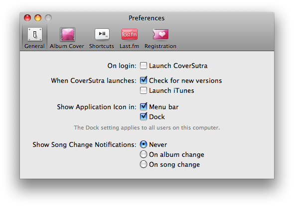
I think it's incredible when someone puts a lot of thought into a minor part of an app. It's easy to punt on something like Preferences, but if you do it right, it rounds out the entire experience. CoverSutra probably has one of most meticulously-designed examples of this I've seen.This one screen really says it all:
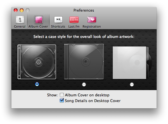
There are several subtle elements at play here. For example, many would have prepended "Show" onto the title of each of the checkbox items, but instead the Show prefix is shifted to the left. This simplifies the layout and makes it clear that both checkboxes relate to display.
The presentation is fantastic. Instead of just using a dropdown with labels like "Style 1" and "Style 2", we're treated to a beautifully-rendered showcase that allows you to see all styles at once. And they're not just composited on a blank background, but rather a custom wallpaper.
In my opinion, that wallpaper raises the experience of this entire window. There's absolutely no reason somebody would need to do such a thing, so when a developer does something like this, it's clear that they really care.
This leaves the user with the impression that the software is not just functional, but actually special. This is how you convert users into fans.
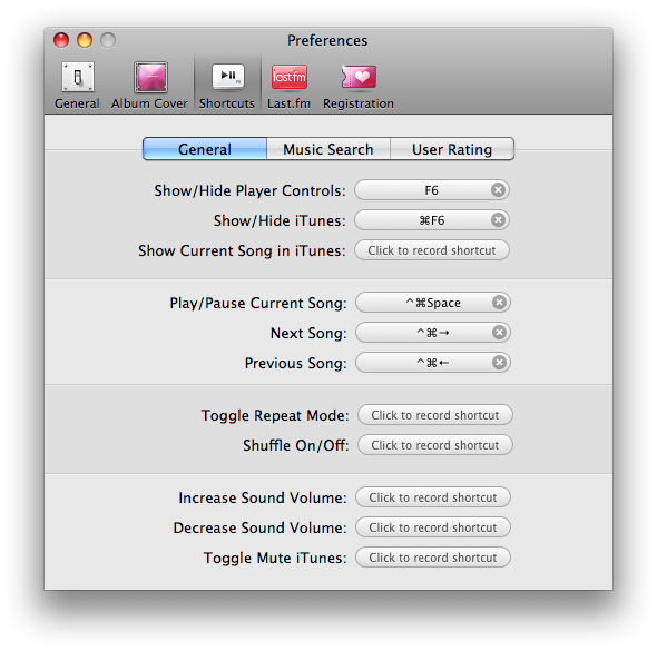
Not only does CoverSutra allow you to set shortcuts for a number of common functions, but the presentation of these shortcuts in preferences is artfully done. Many applications display the shortcut in a generic text field, but these are actually rendered as buttons, which makes it much more clear that you can click them.
Finally, and perhaps most importantly, the text is worded and positioned exceptionally well. The prompt text aligns to the right, the wording is simple but clear, and the labels for the toolbar items aren't conceptual, they're direct and functional. Rather than "Appearance" the section is called "Album Cover".
Of course, the overall function and look of the application is fantastic in general, but I've almost never seen so much attention given to this part of an app. When you create a preferences window, this is the level you should be aiming for. Flawless.

Excellence in Preference Windows
Posted Jun 7, 2008 — 27 comments below
Posted Jun 7, 2008 — 27 comments below


Michal — Jun 07, 08 6037
Each part of this app is wonderful.
Michael — Jun 07, 08 6038
Kevin Walzer — Jun 07, 08 6039
Jesper — Jun 07, 08 6040
As the original creator of Shortcut Recorder (the shortcut field CoverSutra's using), I think the simple button gradient is inspired; the field's plain white otherwise and this simple move adds a bit of character. The extent to which Shortcut Recorder fields don't look clickable out of the box is of course my responsibility. I will defend myself by pointing to the awkwardness of using ordinary-looking text fields to enter shortcuts, which makes it ambiguous if typing delete is going to clear the field or set the shortcut "delete", or if typing tab is going to move the focus or set the shortcut "tab". As such, the field looks similar but not equal to a text field (for input) and is rounded, which evokes the sense of something more specialized (think search fields, and those blue tokens in token fields). And as such, the field is state-driven, where you click the shortcut display to enter a new shortcut and may cancel out of that state.
At the end of the day, an app should have a well laid-out Preferences panel which already includes factors like wording, setting grouping, whitespace and tab labeling even if you cut out decisions like what should be a preference and whether custom controls should be used. Sometimes you're going to want to go the extra mile to apply some finish to it, and some might consider CoverSutra an example of going over the top, but I don't. I think it's an appropriate and comfortable level of 'glitz' compared to how the rest of the app feels. If you hate this level of visual detail (or even the idea of this level of attention spent on the appearance of the Preferences panel), you probably aren't going to like the rest of the app to begin with.
Daniel Tull — Jun 08, 08 6041
In fact in all of the preference panes shown, there is a huge inconsistency between capitalised and uncapitalised letters.
Matt — Jun 08, 08 6042
I gotta say, I think this is another case of nothing more than a typical GUI-fetish Mac user melting over beautiful 2.0 icon/design.
Take that original screenshot, eliminate the CD cases, and ask yourself what exactly is special about this preference pane? Other than the inappropriate use of the radio buttons without labels and the capitalization errors...
Ben Copsey — Jun 08, 08 6043
I wonder if we would have arrived at Aqua without the likes of KPT all those years ago?
Congratulations to Sophia for a really beautifully designed application!
Scott Stevenson — Jun 08, 08 6044
I think it's a tough sell that this somehow ruins the experience. Fixing it would be an improvement, but we're splitting the finest of hairs here. So I'm willing to retract the "flawless" and replace it with "nearly flawless".
Take that original screenshot, eliminate the CD cases, and ask yourself what exactly is special about this preference pane?
It's sounds like you're already made up your mind about it, and that's fine. I might have a different perspective on this because I've looked tons of Preferences windows and scrutinized them over and over. This one gets so many things right that the others miss, and the fantastic artwork is just the icing on the cake.
It's easy to overlook the subtle touches like the slightly alternating group colors in the shortcuts area, as well as the incredibly detailed work on the Registration icon. Granted, not everyone cares about stuff like that, but I think it only endears the app more to those that do care. That's the art of the thing.
Johan — Jun 08, 08 6045
Danny Greg — Jun 08, 08 6046
By this I meant the rendering of the styles so we can see what they all look like at a glance, this saves time and extra steps on the part of the user.
I, however, think that the wallpaper choice is not so spectacular. Its neat but maybe remove the hearts and go with something a bit more standard. Better yet do what Apple does in Icon Composer and use a standard background or even better, the user's current background. Although then you are putting the overall look of the UI out of your hands which would leave me slightly uncomfortable.
I guess my overall impression is what the heck is so special minus the CD cases which is an inspired idea.....
Martin — Jun 08, 08 6047
The UI of CoverSutra has got nothing to do with KaI tools� Please!
Matt — Jun 08, 08 6048
Wanted to add real quick that I didn 't mean to criticize your article or the design efforts put forth in CoverSutra, (both of which I can appreciate). Only trying to point out my personal observation that often times people (including myself) seem to interpret nice icon/graphic eye candy as good 'design' when in fact a closer look reveals that the design of the UI itself might be quite ordinary or in some cases even mediocre.
Sophia — Jun 08, 08 6049
Labels that are not full sentences should use the title style which means that you nearly capitalize every word.
Text on controls like checkboxes should use the sentence style which means that the first word is capitalized, and the rest of the words are lowercase, unless they are proper nouns or proper adjectives. You can read more about this here.
The two "Album Cover" and "Desktop Cover" options are capitalized because both describe a noun or single concept. It's not a desktop and a cover or a cover on the desktop, it's a "Desktop Cover" - one thing. This is a bit like the distinction between "sitting in the front row" and "using Front Row" ... get it?
Guy — Jun 08, 08 6050
Having recently read those same guidelines myself (I'm working on learning Obj-C + Cocoa) I kind of personally assumed that's what style/rule what you were trying to follow.
I think the confusion comes from the "Album Cover on desktop" for me. I honestly don't know what the "right way" would be. If it were me, I would capitalize "Desktop" in that sentence.
I'm not sure Apple's always positive what to do either. Take a look at the Expos� tab/group in the "Expos� & Spaces" section of System Preferences. There's a sentence that ends "[...] or hide all windows to quickly locate a file on your desktop." Then 2 items below that you see a combobox/dropdown/popupbutton with a label saying "Show Desktop:". Both the sentence and the label are referring to the same concept/idea/noun, but in once place you have "Desktop" and the other "desktop." Things like that confuse me.
Nigel — Jun 08, 08 6051
I have to say, I don't think it's fair to call this type of interface fussy or over-designed. Nothing here is glitzy for the sake of it. You could criticise something like the Shiira browser's page transition effects for that. This, on the other hand is highly functional, and Sophia has applied care to her craft to make sure every detail is correct. Positioning, labels, icons, etc.
Danny — Jun 08, 08 6052
Andrew Pontious — Jun 08, 08 6053
In my experience, no self-respecting Apple user app would use checkboxes like that. They would have some way of showing which album style to pick with a custom highlight, or a custom focus ring, or something. Not a plain-Jane radio button which, as mentioned in a previous comment, doesn't even have a label.
Daniel Tull — Jun 08, 08 6054
Also, the last screenshot shows "Menu bar", which again I think should be "Menu Bar". It really doesn't help that Apple use both "menu bar" and "Menu Bar" in System Preferences.
I also agree that it's this kind of debate that makes Mac software so much more. :)
Scott Stevenson — Jun 08, 08 6055
I think the heart wallpaper is fantastic. Not necessarily because I feel there's a lack of hearts in UI design, but because it's a personal touch. It adds culture and character to the thing. It takes guts to go off and do something different.
The approach is clever because the hearts are very small (literally 9x9) and are chiseled out of a dark gray background. I doubt most people would even notice the pattern at first glance.
In any case, I think some may have missed the point here. You may agree or disagree with the particular design decisions in CoverSutra, but there was clearly a lot of care put into it. I'm not necessarily saying everyone should go add hearts to their Preference windows.
@Matt: often times people (including myself) seem to interpret nice icon/graphic eye candy as good 'design' when in fact a closer look reveals that the design of the UI itself might be quite ordinary
Graphic design isn't separate from user interface. If we're talking about visual user interfaces, then the visuals are a part of the overall design. Sometimes the interaction model stands out more than the graphics, sometimes it's the other way around. Clever visual elements combined with standard interactions can, in my opinion, absolutely be called "great design".
If the visual elements are somehow an obstruction to using the thing, than I agree with what you say. I don't think that's the case here.
@Guy: I think the confusion comes from the "Album Cover on desktop" for me. I honestly don't know what the "right way" would be
We're into extremely fine areas of language. As you say, it's not always clear in software if something is a proper noun or just a noun. In a lot of cases, the developer is the only true authority on which things are generic terms and which refer to specific features.
In this case, "Desktop Cover" seems to point to an element specific to CoverSutra, whereas "desktop" is a generic concept. The Leopard page for this topic uses desktop in the lower-case form, except when in a title.
Take a look at the Expos� tab/group in the "Expose & Spaces" section of System Preferences
It's used correctly there. As Sophia pointed out, only proper nouns are capitalized in complete sentences, but the "Show Desktop" is actually the title of a menu item, so nearly everything is capitalized.
Scott Stevenson — Jun 08, 08 6056
A menu bar is a generic UI element present in many environments. It should typically have the same capitalization rules as the words "icon" and "mouse". The exception about using it in titles still applies, of course.
Garrett Murray — Jun 12, 08 6067
It's 2008. We have fast computers, nice user interfaces, and its time we flexed our muscles a bit in the looks department. Saying that just because something has hearts in a background image it shouldn't be done is like saying all pairs of jeans should be two straight legs, blue with 5 pockets. There is room for design. There is room for flair. There is room for flash. Amazingly, it is possible to combine great UI/UX design with great graphical design. Users aren't confused and they appreciate the work done.
We (Mac users) are in a lucky place: We have beautiful hardware that actually runs beautiful and fast and secure software. Complaining that a palette being semi-transparent or hearts in a background of a beautiful preference tab is beginning to make you sound like you're 65 years old and you just don't want things to change. 'Kids with their fancy pants these days' and all.
If an application is thoughtfully designed, usable and fast, I say let's design the crap out of them. Let's make things look great all the time if we can.
Of course, I also have painted walls and things hanging in my apartment. I'm sure commenter #2 Kevin Walzer has square white rooms so as to avoid the "fussy" and "overdesigned" look of today's modern homes.
Anonymous — Jun 12, 08 6068
I want to say that I am thoroughly impressed by the way you wrote your comment with proper grammar. The first sentence, phrased as a question, particularly stunned me; not many people know to put the question mark inside the quotation if it is ending the sentence. Kudos, friend. By the way I disagree with you.
Qwerty Denzel — Jun 14, 08 6071
In the first image, the show label has two check boxes following it which use the title case format. As this is really two sentences, I believe it should follow the lowercase format, with the first word capitalise. (Look to Safari's preferences, which uses this style, with the exception of the preposition in being left lowercase).
The key shortcut section uses the title style correctly, as the labels are actions, not sentences. However, I would say the 'Show Song Change Notifications:' (in the 3rd pic) is the start of a sentence, and so should follow the lowercase format.
Overall, I think CoverSutra's preferences seem to be very well done, especially the choice of the Album Cover section as opposed to Appearance, also avoiding the inappropriate use of the generic Appearance System pref pane icon.
One of my pet hates with preference panes is the use of an Options section amongst the others - clearly a sign of not caring.
Oh, and also the putting of general, commonly-used preferences under the advanced section! (such as update-checking.)
Qwerty Denzel — Jun 14, 08 6072
Please fix, Scott, if you would, and feel free to remove this comment afterwards.
Kevin Walzer — Jun 18, 08 6074
"Of course, I also have painted walls and things hanging in my apartment. I'm sure commenter #2 Kevin Walzer has square white rooms so as to avoid the "fussy" and "overdesigned" look of today's modern homes."
This is an ironic comment, considering that the aesthetic of so many of Apple's products and even packaging veers exactly toward minimalism: a lot of white space, restrained use of logos, etc.
As for the preferences window above, I stand by my earlier comment: I think it's overdone. A preferences window doesn't need this much adornment.
Another point: a lot of these points boil down to matters of taste, as aesthetic debates often do. It's not a matter of "right vs. wrong" so much as "what I like vs. what I don't like." David Hume's essay on taste would make for instructive reading.
Val — Jul 01, 08 6129
Do you think tool tips should be used in Preference Windows?
Web Development Surrey — Jan 11, 10 7100
And there is alot of points that i and i suppose many others would not have thaught about...
Thanks