


Visible Borders in Designs
Brent Simmons mentioned Theocacao a few months back, noting the "page-in-a-page" technique used in some site designs. I don't know if there's an official term for this style, but I call it visible borders.Brent says that he prefers a design without borders, though suggests some possible reasons in favor of using them: compensating for larger displays, adding contrast to bring attention to the content, and making the design feel more like real-world materials.
I think there's some truth to all of this, but my main reason for it is a bit different.
Avoiding "Scanning"
Programmers understand the idea of "polling", which is checking for the state of something on a reoccurring basis (which, by the way, is discouraged in Cocoa, in favor of notifications). People will continually check the water to see if it's boiling or look down the street to see if the bus is coming.
For both computers and humans, polling is relatively expensive. For computers, it takes CPU cycles, for humans, it takes mental energy.
Reading content on a web page is often a lot of work. Readers have to try to separate content, comments, ads, navigation, and even elements that appear on mouseover. They also have to contend with the fact that layout may change drastically as they scroll down the page and new elements are revealed.
The active mind is constantly scanning — in other words, polling — for new areas of interest, as well as looking for things that have to be manipulated to continue, such as a "Next" button. And even if this isn't the case on your site, readers are conditioned to expect this.
On a printed page, the content and format are static. Words aren't going to suddenly appear outside of the boundaries of the book edges, and most importantly, there's no scrolling of any sort. The mind can relax because you can see at a glance exactly what is available to you.
Another key point here is that not all books are the same size or orientation. Books of quotations tend to be very small and square, while coffee table books with photographs are often large and in a landscape orientation. Novels are portrait orientation and relatively small.
The physical design of a book results in visible borders as well, it's just that a book does layout in three dimensions instead of just the two we get on a web page.
Visual Cues
Since each web site doesn't come with a different physical frame like a book does, designers use borders to convince the reader that they don't need to be constantly scanning for content areas.
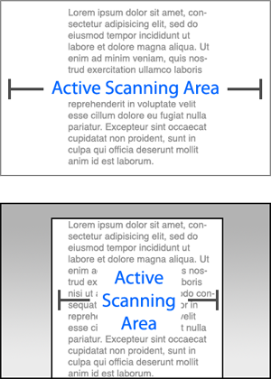
No one is expecting the main content of an article to suddenly appear outside of the boundaries of the "virtual page," so the mind can temporarily mark that as out of bounds, even as the page scrolls.
Visible borders are just one technique. You can use color or opacity to reduce scanning, too. This is why a Cocoa "source list" makes for a cleaner separation between master and detail views than two regular, plain white tables do.
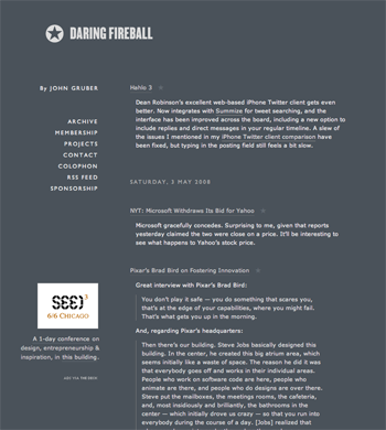
Daring Fireball is an excellent example of how to make a borderless site work well, but there are several key elements that go into it:
1. The navigation and ads only appear within the first full "page". Past that, the entire page contents is within the one column. If the additional elements continued to appear on the side as you scrolled, I don't think this approach would work as well, because elements would just spring out of nowhere.
2. The content comes in two varieties: long rectangular articles, and square-ish link blocks. To me, this results in implied borders, which is helped out significantly by the underlines in the link title and the vertical lines against quoted text.
3. The design in so unique — particularly because of the background color and narrow columns — that the reader knows that the typical rules do not apply, so they take on a new set of layout assumptions specific to this site.
4. The navigation text and site title are in all caps, which is clearly not content.
One Last Thing
In his post, Brent mentions this:
The engineer in me says that the page is already in the browser-window box - another box is just not needed, it's waste.
I'm absolutely fascinated by this comment, because Brent is telling us something about the way his brain works. Many people are not willing or able to tell you how they see something, so you have to try to read between the lines. I completely understand Brent's perspective, and I can arrange my head in this way by choice, but it's not natural for me.
For me, when I look at the web page, I lock focus on the browser window itself. I'm not thinking about the browser window in the context of the larger window in the window server and so on, I'm "zoomed in" to the content of the window. I suspect this is a common experience for consumers in general, and is certainly the case for those who choose to maximize their browser windows.
But this brings up another important point: people rarely read a book or magazine amongst a pile of other open books or magazines. You usually pick it up and walk to a chair or bed to read it. An open web page, on the other hand, is often swimming in a sea of other web pages, instant messenger windows, Finder windows, and so on.

Visible Borders in Designs
Posted May 4, 2008 — 21 comments below
Posted May 4, 2008 — 21 comments below


Sean Todd — May 04, 08 5768
Computers and webpages are full of distractions. Most sites are fully of flashing adds trying to grab our attention and other such things. Putting a border around important content makes it stand out and allows our brains to relax and not (as you put it) poll the computer screen looking for what we want.
Craigslist is a good example of a site that has bordered content by changing the background color. Unfortunately, they don't change it enough and all of the text/links on the main page run together somewhat.
Most sites on the internet, thankfully, have realized the importance of borders. If you look at almost any news site, they will have borders around the different sections. Unfortunately, almost all of them also break your rule of not having a navigation panel that goes past the first page.
Sean Todd — May 04, 08 5769
Chris Papadopoulos — May 04, 08 5771
However, I generally prefer content without borders to make the website as thin as reasonably possible. If you include borders, you have to leave some whitespace between the border and the content, making the website a little wider than it has to be.
In many cases, thin websites provide a few advantages that I like....it's easier to have multiple windows open to do more than one thing at a time, it works slightly better on older monitors that surprisingly many non-technical businesses rely on, it's a little easier for your site to be halfway usable on mobile platforms like the iPhone, etc.
Some of these thoughts are elucidated here with some semi-coherent diagrams here if you're interested.
http://informationrain.com/2007/09/26/designing-for-thinness/
Kirk Gray — May 04, 08 5772
"In his post, Brent mentions this:
"The engineer in me says that the page is already in the browser-window box - another box is just not needed, it's waste."
What if book designers felt this way. "The page already defines the reading space. Why add more to the page?"
Then they would run the text right up next to the edge of the page -- top, bottom, left and right. Sorry. To me that book wouldn't be as comfortable to scan or read. The first thing we learned about page layout was that the most import thing on on the page was the white space -- good use of white space makes a good design, bad use ruins it.
jburka — May 05, 08 5773
On a digital document, I suspect that one reason it makes reading more difficult is that when I get to the end of a line, without glancing down to see if there's a scroll bar, I don't know if the text wraps at the edge or if I'm not seeing the full contents of the line.
I have to be honest that when I first saw Brent's blog post, I found it to be utterly ridiculous. It made me think of one site whose overall design I love, but whose main text area drives me nuts: kottke.org. If the browser window isn't wide wide enough, there's no margin to the left of the text. I find it completely unreadable without widening my browser window.
shaz — May 05, 08 5774
This blog becomes less pretty if you remove the borders, but it does not lose readability, and I would argue it's somewhat less annoying to use, because the horizontal scroll area is narrower without the huge borders.
You see, my browser window is often narrower than your borders, so I instinctively want to scroll to the right to see if there's any content I'm missing, which is extra cognitive load that I really don't need.
I'm not arguing against whitespace, but you have two margins, one inside and one outside the borders, and they are both really large. I would argue that only one is necessary. Nevertheless, it would take away some of the appeal of this design to completely remove the outer margin.
JordyJediknil — May 05, 08 5775
I actually don't think this is valid at all. If you put a second "box", as it seems we've taken to calling them, inside the page (print or web), then you can't run text right up against the edge of the box, either, even if the box has a two-inch margin from the edge of the page on all sides.
Granted, the space you need to leave might be smaller, but I think that's because the space you need to leave is relative to the total width of the box. That's a more useful comment in favor of boxes when space is cramped, but on Daring Fireball and inessential.com the rule is clearly followed anyway. (Although the crash log is currently messing up inessential.com's nice clean center-column layout.)
Personally, I find both sites like this one and sites like those relatively easy to read; it's the sites that try to cram too much on a page that are the most difficult. Same goes for columns that are too wide or too narrow, or those that are intruded upon by ads. The issue of visible box vs. larger invisible margins is not something I think about much.
Harry — May 05, 08 5776
That is, the text is placed within the inner box in a position which is intended to be harmonious: it allows me to specify the relationship between the text and the white space. I don't have control over the size of the browser window, but by putting a border around the content I can frame it in the way want, with the width of the margins in a particular proportion to the width of the text column , the height of the header and so on.
That's the rationale, at least; whether it works or not is a different question.
Kirk Gray — May 05, 08 5777
I want to be able to adjust the width and height of my browser windows to my liking. Personally, I like narrower windows than most websites are allowing for these days. I want to have another to the side (or above, or below). And when I narrow my window, I want the text portions of that window to narrow as well and the text to wrap so I don't have to scroll horizontally.
Unfortunately, most site designs including most blogs aren't designed with the idea that the user might want a narrower (or wider) viewing experience. (I blame Windows for this. For decades Windows programmers have been conditioning people to open an app and click the zoom box to fill the screen, rather than using apps side-by-side.)
Other pet peeves:
1) Links that insist on opening in a new window even when I've told it (via command-click in Safari) to open in a new tab.
2) Links that open little helper windows, usually containing text, that have programmatically turned off my (the user, the client, the customer) ability to size the window. So I find myself on my 24-inch monitor having to scroll through a text box the size of a yellow sticky.
3) Sites that haven't allowed for users that may want to make the text larger. For lengthy or casual reading, I like to push back from my desk and lean back in my chair -- it helps me stretch a bit while at my desk. Often when I do this on-screen text is just too small to read comfortably. So I hit command -+ a couple of times to make the text bigger and easier to read from farther away. Most often the site goes all wonky with text overlapping graphics (or underlapping it so that the text disappears completely).
Eli — May 05, 08 5778
I agree the browser is a frame, but don't make me adjust my frame to match your text.
That Guy — May 05, 08 5779
bananaranha — May 05, 08 5780
And why is this thin/wide thing important?
Not enough pixels?
bananaranha — May 05, 08 5781
What this layout does is what borders in general (as in, between countries) do: it contains. In our case, it is the eye that is contained.
@ gray
For decades Windows programmers have been conditioning people to open an app and click the zoom box to fill the screen, rather than using apps side-by-side.)
Sounds like like those “Windows programmers” did the right thing, preventing us from being inflicted with ADD and losing IQ points and effectiveness by multi-tasking [see various reports on the matter].
Scott Stevenson — May 05, 08 5782
I'm open-minded about doing something about the outer border here, and I understand why it's helpful to do so. It was more about drawing the line how long I spend on trying to get every aspect of the CSS to work perfectly.
@Kirk Gray: I hate it when a website takes too many choices away from me [...] Unfortunately, most site designs including most blogs aren't designed with the idea that the user might want a narrower (or wider) viewing experience.
This is something I've thought about and experimented with a lot. My intention is never to take away from choices from the reader arbitrarily. What I'm trying to do is optimize for the most likely case. The conclusion I came to is that the "narrow window" people are in the extreme minority, so when I designed for variable-width text or even just narrow format, it usually just looked wrong.
Psychology also plays a role. I'm convinced that the longer a run of text is vertically, the less likely a visitor is to read any or all of it because they feel they're committing to a big time block. Making the column a bit wider changes the perceived length significantly.
A situation like iPhone is a different case because the device has a preset size. But there's obviously a reason iPhone-specific sites are popping up everywhere.
make the text bigger and easier to read from farther away. Most often the site goes all wonky with text overlapping graphics
This one isn't due to apathy. It's extremely challenging and time-consuming to design for variable text sizes. It's like finishing a painting and then being handed a paintbrush which is twice as large and being asked to create the same painting again.
It's so difficult to do well without compromising the experience for 90% of visitors that most designers just punt on it. It would be relatively easy if everything scaled, but the problem is that that images stay the same size while text scales, creating a vast mismatch between the two.
Some part of this obviously has to do with the style of design. If there's minimal layout to begin with, then it's obviously easy. But that's not what everyone is setting out to do.
ChrisB — May 05, 08 5783
Scott Stevenson — May 05, 08 5786
I'm not sure the experience would be as great on the desktop because the font is typically right size (or close to it) by default. Zooming would make it ridiculously large, which is often harder to read.
This also goes back to the idea that the "frame" is fixed on the iPhone, whereas the frame on a desktop machine is determined by the window size. This drastically changes what you get from a zoom.
Still, an interesting idea.
Harvard Irving — May 05, 08 5787
With a variable-width column, the line length would only be good once in a blue moon, by pure coincidence. Most readers aren't going to adjust their browser windows for each site to achieve optimum line length. Most people wouldn't even realize the effect that it has on their reading experience.
Interestingly, when I read Brett Simmons, who complains about this, I almost got a headache reading his blog. The line length was so odd, a little bit too long, but not so long that it's obviously wrong. I think this combined with the choice of a sans-serif font with inappropriate line spacing adds up to a very annoying reader experience.
I think we should keep the engineers away from design.
Jenna Fox — May 05, 08 5788
I'd like to suggest a better word for this particular group. It's friendlier: ‘People’
Using the word ‘Consumers’ to me always feels as though the person saying it feels as though they are above the group they're referring to, which is everyone else.
Why do they need their own grouping? Who are these people who don't consume anything? Are you using the word to specify ‘Everyone except monks and crazy jungle people’? Even the crazy jungle people are consuming food from the jungle.
Aside from that, it's a really good article!
Scott Stevenson — May 05, 08 5789
You're absolutely right. The trick is that if I say "people" then highly technical engineers think I'm talking about them too. I use the word "consumer" to refer to people that just use a computer without analyzing the process of using it.
Jason Simanek — May 05, 08 5790
As for the fellow that was frustrated with websites not adapting to narrow page widths, I would recommend he revisit the whole idea behind the separation of content and presentation via XHTML + CSS. He could easily turn off the author's stylesheet, use Opera's feature for applying your own stylesheet or read the site's RSS feed in a feed reader that allows you to create your own custom stylesheet for content (Sage is a great RSS reader Firefox plugin that does just that).
What is this talk of site designers limiting your options? You have more options now than ever.
Web design agency — Jan 06, 10 7085