


New Theocacao Design
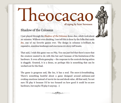
The new Theocacao design is up. I'm including a screenshot for historical reasons. I tried all sorts of different looks before settling on this one. Eventually, I realized I needed a break from the explosion of hyper-modern sites. The idea is to to cleanse the palate a bit.The version I saw in my mind's eye actually looks pretty close to what you see here now. I hope this comes off as being less perfect -- more organic or something. Still clean, but the lines are less perfect and less symmetrical.
It turns out the A List Apart folks came to the same conclusion, though their version is a bit more understated, a bit more perfect. The Theocacao look is intended to be a bit over-the-top and fun, whereas theirs is practical and versatile. I guess that's the difference between a blog and a proper site.
I really like the watercolor illustrations on some of their newer articles, such as this one.
By the way, if you're ever looking for inspiration for design, I recommend browsing del.icio.us/tag/gooddesign.

New Theocacao Design
Posted Oct 25, 2005 — 10 comments below
Posted Oct 25, 2005 — 10 comments below


Grady — Oct 25, 05 457
Only quibble is that I don't like the kerning on the "Theocacao" at the top...
Scott Stevenson — Oct 25, 05 458
Ben Kazez — Oct 25, 05 459
Ben
Scott Stevenson — Oct 25, 05 460
Mike Zornek — Oct 25, 05 461
John Gruber — Oct 25, 05 462
Rob Mayoff — Nov 08, 05 522
Rafa Barber — Nov 11, 05 528
Scott Stevenson — Nov 11, 05 530
Rafa Barbera — Nov 14, 05 545